
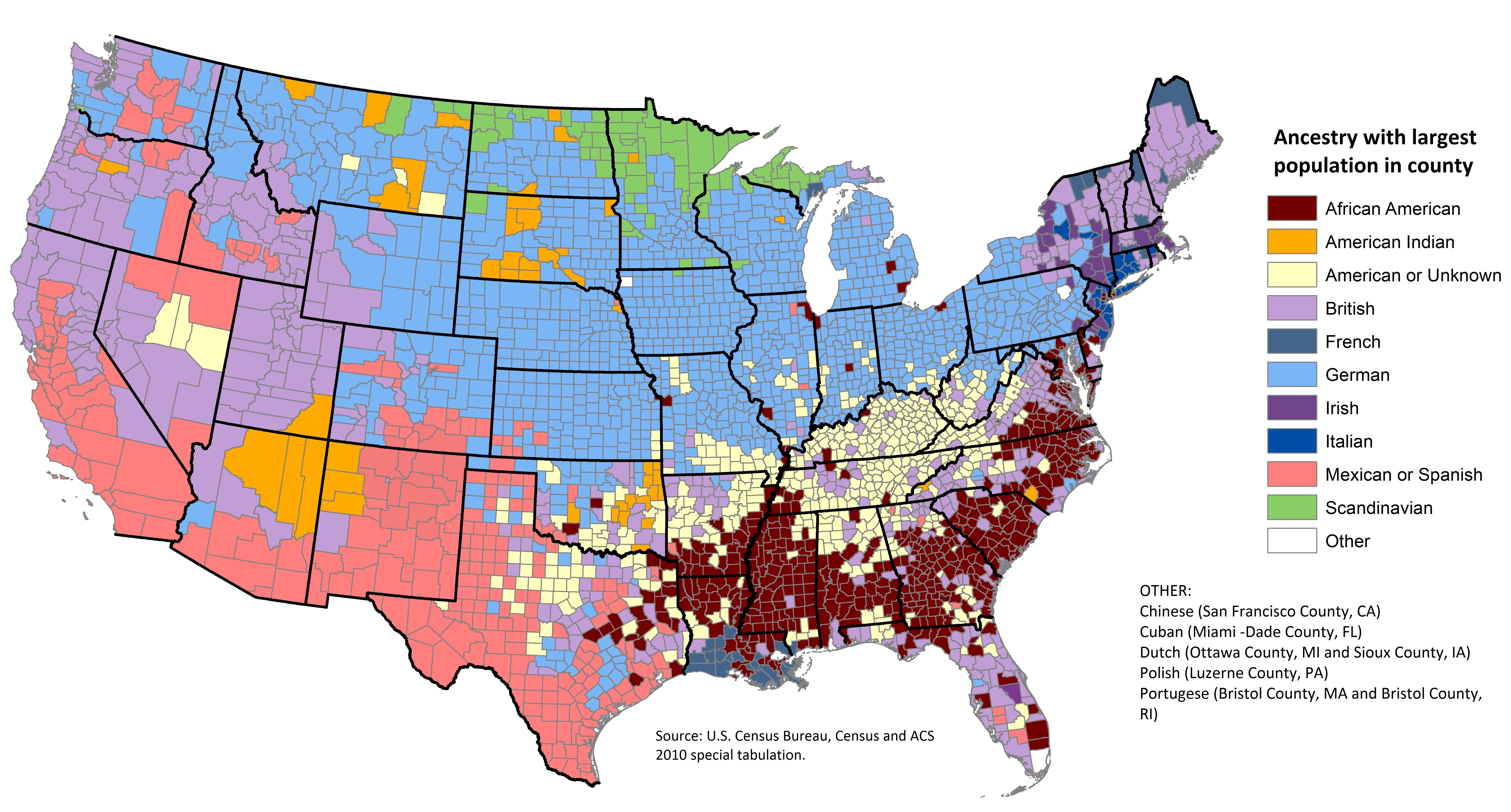
What is the most common ancestry in your county?
Data Scavenger Hunt
Find answers to the following questions using the visual above, any links below, and your big brain:
What is the ancestry with the largest population in your county?
What is the ancestry with the largest population in your state (this is harder to estimate since not all counties are of equal population, just do your best)?
How does American history explain the ancestral makeup of your county/state?
What state in America appears to be the most homogeneous (all the same) and the least diverse?
There are multiple single counties in the North and Midwest that are majority African-American ancestry, but most of the counties with the highest population of African American ancestry are in the South. Why is that?
List one thing the chart makes you wonder:
The United States has been called a “melting pot.” What is a more accurate way than “melting pot” to describe the United States?
How do you think this map impacts current American politics and elections?
What does this map say about the history of American colonization and slavery?
What would this entire map have looked like in 1491?
Write and Discuss
Take ten minutes to write about the question at the top of the page and then discuss with your classmates.
Act on your Learning
Use this U.S. Census bureau data tool to learn the ethnic composition of your nation, state, or county. Share your results with your classmates.
Get Creative
This map looked different 100 years ago and it will look different 100 years from now. Imagine this map one hundred years in the future and make a creative response to describe American ancestry then.
Learn More
Browse more of the maps as Vox tells the story of immigration through maps:
